From Handbill to Keepsake: The Changing Work of Festival Paper
Festival paper can turn from a useful notice into a keepsake. Learn how images, local details and traces of use give printed objects lasting meaning.
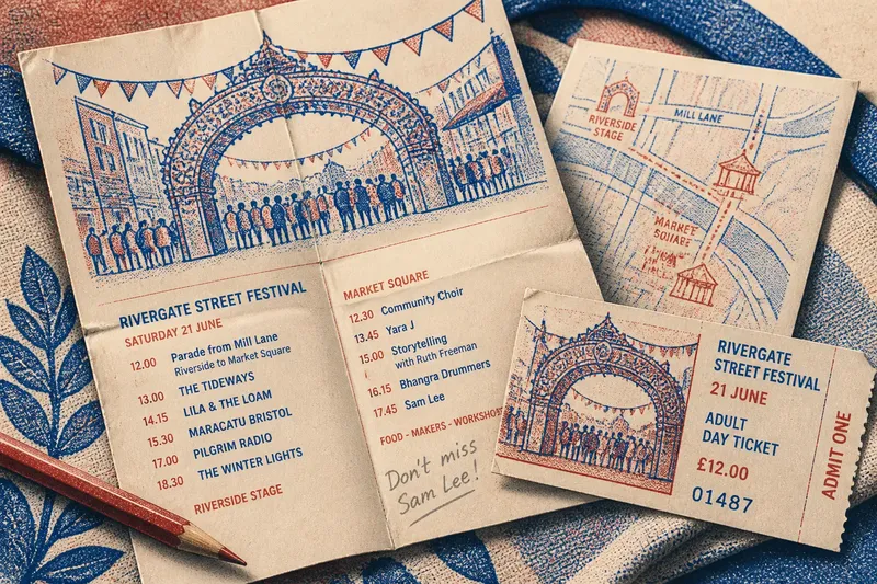
What makes festival paper worth keeping after the event? A programme or ticket needs more than legible printing: it needs a detail that can bring back a particular place, performance or encounter. Festival paper becomes a keepsake when it carries that trace without pretending its practical purpose never mattered.
Specific details give festival paper a memory
A date, venue and event title identify what happened. A drawing of the festival’s riverside stage, the name of a neighbourhood procession or a performer’s listing can make the object feel tied to one gathering rather than to festivals in general. The distinction is much like keeping a well-used paper map: the folds are not the destination, but they show where it travelled with you.
Generic branding has a thinner afterlife. A logo may identify the organiser, yet it rarely recalls what a visitor actually saw. A small local detail can do more: a motif based on a town’s painted shop signs, for instance, can locate the paper in a place even after the schedule has passed.
Say you attend an invented street festival and receive a programme showing a hand-drawn arch from the parade route, alongside the names of the performers. You fold it to mark the page for a music set, then keep it with a ticket bearing the same arch. Later, the image and pencilled fold point back to that particular afternoon; a plain sheet with only the festival name would offer less to remember.
Handling leaves its own record
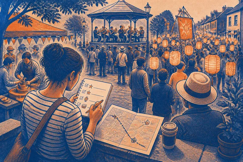
Paper changes through use. A programme may acquire a pencil mark beside a performance, a crease at the map, or a smudge from being carried between stalls. These marks are not a design feature organisers can prescribe, but a readable, writable surface makes ordinary use easier and lets a visitor add a small personal note.
Choose materials with that use in mind. A glossy finish can resist pencil or pen; a very delicate sheet may not fare well in a pocket. If the paper is intended to be marked or folded, an uncoated stock and a clear fold or binding can make it more accommodating. The object does not need to be precious. In fact, a programme that feels too precious to handle has misunderstood its assignment.
Design should belong to the gathering
An illustration, typeface or colour scheme can make festival print recognisable, but visual distinction is not the same as decoration for its own sake. A useful design gives the reader a sense of the event’s character while leaving enough room for names and context. Local craft, landscape or a recurring festival ritual can provide material, as long as the reference is clear rather than an obscure in-joke.
Consistency also helps separate an object from a generic souvenir. If a programme, ticket and small printed map share a motif, they can form a recognisable set without repeating the same image everywhere. Different formats still need different purposes: a ticket records entry, while a programme can preserve a wider account of who and what was present.
What makes festival print worth keeping?
Which details make a programme feel specific?
Names of performers, venues and local events connect the programme to what took place. A distinctive illustration or motif can strengthen that connection if it relates to the festival rather than serving as anonymous decoration.
Should a keepsake programme be writable?
If visitors may mark a route or note a performance, choose a surface that accepts ordinary pencil or pen. A smooth coating can make that awkward, so match the finish to the way the paper is likely to be handled.
Can a ticket have commemorative design?
Yes, provided the design leaves required admission details easy to see and follow. An event name or image associated with the gathering can give the ticket a personal connection without obscuring its function.
How can organisers avoid making print feel generic?
Use a specific visual reference, such as a local motif or an image connected to a recurring ritual, and pair it with names that record who took part. Avoid relying on a logo alone to carry the identity of the event.
Keep the useful information alongside the keepsake detail
Commemorative design cannot compensate for an object that leaves visitors unsure what it records. A programme needs enough context to identify the events and people listed; a ticket needs its admission information intact. The useful details are part of the memory, not an obstacle to it.
Before approving a print design, check each item and decide what to change:
- Check whether the festival or event name is clear; if it is missing or vague, add a specific name, otherwise keep the existing wording.
- Check whether the listed performers or participants can be identified; if names are absent, include them where appropriate, otherwise retain the readable list.
- Check whether a local image or motif has an evident connection to the gathering; if not, replace it with a recognisable reference, otherwise keep it.
- Check whether the type leaves practical details easy to read; if decoration competes with them, simplify the layout, otherwise preserve the design.
- Check whether visitors are likely to write or fold the paper; if so, choose a suitable surface and format, otherwise prioritise the object’s intended display or distribution.
- Check whether ticket details remain clear beneath the commemorative design; if they do not, move or reduce the artwork, otherwise approve the balance.
Festival paper earns a second life through a particular image, name or mark that connects it to an actual gathering. Keep that detail legible beside the information that made the object useful in the first place. When festival paper is the search in question, the lasting value is not simply that it survives in a drawer; it is that it can still tell its owner what the day was.